1. Gallery Wall: this is the ever-popular collection of frames in a grouping. You can do this so many different way: same colored frames, different colored frames, all art, all photographs, a collection of mix matched photos, art, quotes, etc. I love gallery walls going up a stair case like below (notice the mix of wide and thin black frames to give it interest):
via
I also love gallery walls in living rooms. This one does a great job of maintaining balance, even though it is asymmetrical. You can also see here that there is an awkward window on the left side of the couch, so they probably hung these frames strategically on the right side to balance that out.
via
Then there are symmetrical gallery walls! These make my OCD heart really happy ;)
via
This last one combines gallery wall with shelving, our next way to fill up wall space! I'm loving the look!
via
2. Open Shelving: floating shelves are a great way to fill wall space, because they give you linear lines (which actually makes the room appear larger) and you can display things on the shelves. It's a win-win!
via
You can see here on either side of the fireplace that without these floating shelves, the space would have been really bare. These fill up the space, detract from the big black TV, and give the home owners more space to show off their unique finds, books and more.
via
3. Mirrors: One of the best ways to use mirrors is by hanging it on the opposite wall of a window, so that you're maximizing the natural light. The light will reflect off the mirror and bounce onto other walls. Mirrors also give a bit of a feminine touch (of course, depends on the actual look of the mirror!) and adds depth, as well as a touch of metallic to the room.
Hanging one in the entry is always a winning choice, because it's so convenient to look in the mirror before heading out! A round mirror is a perfect way to break up the boxy look of rooms. If a room has a lot of rectangular or square shapes, intentionally hang a round mirror to mix it up!
via
It's important, when considering a mirror, to think about the shape. Round, rectangular, square, floor length, arched. There are many options! I love the arch look for this space, because it makes the ceiling look even taller!
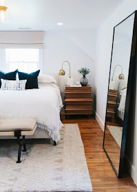
Floor length mirrors are large, so they make a big statement and take up a big chunk of wall space. If you have a tall blank wall, this is a great place for a floor length mirror! They are especially perfect for a bedroom. I also like them in the end of a hallway, especially if the hall isn't well lit. Again, mirrors reflect light and that would help bring a bit more light to a dark hallway.
One of my favorite examples of beautiful art in one of my client's homes is this coastal family room. It also happens to be my parent's house :) They love a beach town in Northern California called Carmel, so the painting is of one of the beaches there.
Abstract art is great for a more modern, contemporary or mid century look. They typically play with texture, which is a needed element in every room!
via
Minted
5. Clocks, Signs, Vintage Finds: these are special elements that further personalize your space.
City Sign
Love how this clock is stacked over a rectangular planter to offer a different shape to the vignette:
via
6. Textured or patterned walls: Not only is a fun wallpaper a great way to make a big impact on your walls, but so are wall textures created with wood trim (called board and batten).
via
via
Wallpaper magic! I'm so excited to be installing some wallpaper in a current client's home. It's going to be so beautiful! We're doing it in the powder bath and the master bedroom.
via
via


No comments
Post a Comment
Thank you for stopping by! If you have a specific question, please email me at hello@michaelanoelledesigns.com. I always reply to emails! Have a blessed day! xoxo