Monday, April 8, 2019

Client Reveal: Master Bedroom & Bathroom with Gingham Touches

Up next in the tour of the Parade of Homes house I did for last fall's parade is the master bedroom. It's such a pretty, relaxing and neutral retreat. I love so many things about it, from the white bedding, beautiful upholstered bench, window treatments, lighting and the big shower in the bathroom-- it's all so lovely.

The only pattern we have in the room are these gingham pillows and everything else has a texture, but not a true pattern.
wood accent 

These window treatments turned out so beautiful. They are a roller shade, made to look like a woven material. I love the contrast and warmth it provides! We layered it with white curtains to bring height to the room and soften the shades a little. When the rollers are down, they will be light filtering and offer privacy, but will not be black outs.


The shiplap on the ceiling provided such a sweet added detail. It makes the room feel a little extra special and makes the lighting pop!


mirror 

Now for the master bathroom:
The homeowners went with a gray cabinet (the same as the kitchen island) and a really lovely quartz countertop with some grays and whites in it.


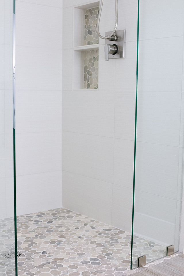
The shower is SO beautiful and features river rock floor, glass doors and walls, a rain shower head and one on the walls, and some really cool niches with the same river rock as the floor.


 Designer Tip: I've seen river rock done a couple times now and the way it looks best is with LIGHT GROUT. Remember my parents bathroom reveal? The tiler picked up the wrong grout and did a really dark gray when what we wanted was a lighter gray. I'm not saying their bathroom looks terrible, it just looks better when it's lighter ;)


I love that we went with this pretty and unique roller shade for the bathroom!

This rug is one of my favorites in the house. It's actually from Pottery Barn Kids (sometimes you can cheat like that and find cheaper rugs on the kids stores, even though they're the same quality!) It's on sale now for $100 off, making it under $200!


Steve Visser Builder  / Flowers / Window Treatments / Photos & Design: Michaela Noelle Designs
Thanks for sticking around for the tour! Next up I'll show you the kids rooms :)

Other Rooms in this House:
Kitchen & Dining Room
Living Room
xoxo
interior design website / services / portfolio
*affiliate links used

2 comments

  1. What about the framed print? That's lovely!

    ReplyDelete
    Replies
    1. That's actually wrapping paper! It's from one of my favorite artists: http://www.carleighcourey.com/gift-wrap

      Delete

Thank you for stopping by! If you have a specific question, please email me at hello@michaelanoelledesigns.com. I always reply to emails! Have a blessed day! xoxo

Back to Top