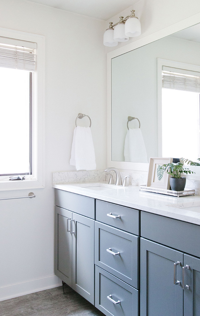
We turned that right around and made it nice and bright! We got a new, updated vanity at a higher height and with a gorgeous quartz countertop. The flooring got upgraded and it made a huge difference! Other updates included new faucets and new hardware on the drawers. Since the family is thinking of selling their house in the coming year, we didn't do anything over the top and decided not to switch out the mirror or light fixture.
Another element we changed out was the cabinet above the toilet. The original one was a little dark and large for the space, so this open shelving gave it a lighter feel.
Can you even believe this?! Taking down the storage tower allowed for double sinks to be a reality! A huge selling feature for potential clients. We obviously got a new vanity and opted for a pretty gray color. We did the same quartz as the hall bath, new faucets, lights above each sink, new hardware and a new mirror trimmed out in white.
The toilet nook used to be dark and not necessarily a highlight of the space ;)
With the addition of two wood floating shelves, it's now a great area to display some pretty decorations and store cotton balls and q-tips.
I LOVE this quartz! The veining is so beautiful.
Probably the biggest transformation was this shower. It's only a 3x3 space and the thick fiberglass insert took up about an inch and a half of space all around. The shower door was also dated.
We ripped that out and installed large subway tile with a gorgeous marble niche and light gray grout. The niche tile color ties right into the new gray vanity color. The new fixtures look SO pretty!
Want to know a fun fact? I actually met these clients at the dog park while Lincoln and their dog, Macy, were playing! We got to talking and when they found out I was an interior designer, they told me about their bathroom projects and we exchanged information. So thankful for this "meet cute" ;) How sweet is Macy?! I think she even likes the new bathrooms!


Nice updates, but I would have definitely "fought" to change out the light fixture and mirror in that half bath. Those really do not have to cost much and make a huge difference.
ReplyDeleteBoth turned out so great! I'm thinking of doing something similarto the first bath in our upstairs bathroom. What paint color did you use? So pretty!
ReplyDeleteThank you so much! The color is Classic Gray by Benjamin Moore :) Good luck with your project!!
Delete