Friday Finds: Nordstrom Sale Favorites (Last Chance!)


This week flew by for me. What about for you? The only "Finds" you need to know about today is the Nordstrom Anniversary Sale! There are so many awesome items-- all on MAJOR sale. I am still trying to decide between the color of the scalloped flats I want to go with. I love suede black (perfect for fall) or the nude! 

Most of these items are all under $100! Click on the purple box to shop the product:


Shop the rest of my favorites here:


There are some adorable things on sale for kids, lots of dapper menswear and awesome home decor on sale, too.

Don't forget the sale ends on August 3rd and prices go back up to normal! Finally, there are still some tickets left for our Seattle Bloom Bash Workshop this fall! Would love to meet you. 

Happy Shopping!
xoxo

Photobucket
1

Inspiration in the Sunset


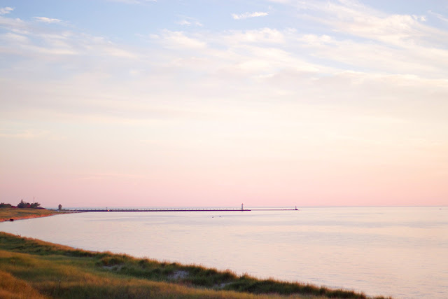
This past weekend we went to the beach for the day, and goodness gracious! This sunset. I've always been enamored by the pastel hues of a sunset. When I first moved to Michigan, it was a common occurrence for me to say to my boyfriend, "Look! It's so pretty!", pointing out the sunset in the distance, in the middle of dinner on the porch or driving somewhere in the evening. He took note at how much joy this beauty brings me, and now he's often the first to point out a sunset's saturated palette. It warms my heart :)

I think what I love so much is how unique each sunset is from another. The clouds and vibrancy of the colors are always different and beautiful in their own way. I've always found such inspiration from sunsets. They're simple, they're colorful, they make the water sparkle, and God made them. That alone is kind of the coolest thing!

I rounded up a few beautiful home decor items inspired by the beauty of a sunset.


Coastal and sunset-inspired home decor:


Do you love the sunsets as much as I do?!
xoxo

Photobucket
0

The Perfect Gift Box


If you know me, you that my love language is found in handwritten notes and gifts. I love love love to give special little things to friends and family (hey, it's fun to receive them, too!) Fun fact: a handwritten note from my boyfriend melts my heart more than going out on a date sometimes :) 

Anyways! All of that leads me to one of my new favorite finds: BOXFOX.  If you love gift giving, you will quickly fall in love as well! Sometimes we don't have enough time to shop for and then ship the perfect gift to our mom, sister, or BFF, so the geniuses behind BOXFOX do it for you! You can shop pre-curated gift boxes OR build your own! If you want to send a little motivation to a friend who loves working out, you'll love the Move box. Have a friend who just became a new mom? The Hey Mama box is perfect. Can't think of the best way to ask your girls to be your bridesmaids? Send them a Bridesmaids BOXFOX. (Seriously tucking this idea away for future use!)

Chelsea, the owner and creative director behind the gift box shop, let me build my own BOXFOX and the day it arrived was one of the happiest mail days I've ever experienced. Want to see what I included? 

First, I have to note the quality of the pale blush boxes is incredible. 


In my box was a static spray I keep in my car now, just incase static gets the best of one of my outfits on the way to a client meeting. I also got the yummiest smelling Gardenia candle, bath salts for a nice foot soak (after teaching a workshop, this is the only thing that remedies tired feet!), a pink water bottle to carry on the go (I try to drink 2-3 of these per day), and jewelry cleaner wipes.


These bling wipes are quite amazing. My rings, bracelets, necklaces and earrings have never looked better.


I sent a BOXFOX as a birthday gift to a friend and she loved it so much-- almost as much as I loved putting it together. Best part? The gift boxes are affordable and at different price points, perfect for every budget. So, who's going to send a Boxfox next time they're in need of a birthday gift, bridesmaid present, or a just-because token? This girl is! I'm even thinking of making these my client gifts at the end of a design project. If you're a current client of mine pretend you didn't read that ;)

If you could chose any box in their shop, which one would you pick out?


Photobucket
4

Home Decor Favorites

The Nordstrom Anniversary Sale is popping with amazing deals on clothing and accessories, but have you overlooked the Home department?! If so, I'm showing you all my favorite interior picks from the sale. I love Nordstrom for their easy, neutral and classic aesthetic. I bet you do as well! Here are some faves:


I ADORE that bar cart and heaven help me-- those Mr. & Mrs. glasses?! I might need those one day ;) Add a touch of rustic glam to your bathroom or kitchen with these brass soap dispensers. Do you have ugly countertops like I do in my kitchen and bath? You can dress it up with a little marble tray!

You can find the clothes and accessories sale here. I pulled all my favorite things from the sale and showed you last week! Did you get anything yet? 

Enjoy your Thursday! This week is flying :)
xoxo


Photobucket
2

Behind the Scenes: Branded Images


On Monday we hosted Bloom in Charlotte, and I've stayed a few extra days to spend time with my friends Lauren and Andrea. Yesterday Andrea took some beautiful photos for my blog and website. She's a pro at taking beautifully curated, soft and brand-appropriate images. It's so important to have images like these for your business. It helps your brand look professional! For more reasons on why to have pictures like these for your website, read this post by Elle & Company. Don't be fooled though, it's not as easy as it looks! We were styling these images for well over 4 hours. I wanted to give you a sneak peek into the process.

Though this above set up looks like a desk, it's actually a coffee table. By setting up the camera at the level of the coffee table top, it makes it appear like a desk or table.


A tripod is key for shoots like these. It helps avoid any shaking, allows you to shoot at a higher aperture to get all the details in crisp focus. Like I always tells guests at The Bloom Workshop, it's also key to keep checking the photo in the camera (or on the computer screen in this case), because it can look so different than it does to the naked eye. Sometimes details need to be moved just a hair to make the image even better.


We played around and added my planner to the mix below:


You can see that the left side feels too heavy with the planner, so I switched that flower arrangement with the one on the right, and it makes a huge difference. The smaller flower arrangement had to move to the left side in order to make the visual weight of the image evenly distributed.


Professional photos by Andrea Pesce Photography

Kind of fun, right?! I can't wait to share more in the coming months! 

Do you have branded photos for your brand, shop or website?

Happy Wednesday! Don't forget Registration for The Bloom Workshop opens at 12pm EST TODAY!

xoxo
Photobucket
4

Home Tour: Neutral & Contemporary


My Domaine  via Alvahem

Oh, this bedroom. All the textures, the oversized art, the chandelier. All the things! Other than the bedroom in this apartment, the kitchen is another favorite space. I love how the backsplash glistens and how all of the plants in the space bring in texture and a rich, green hue. The key to a neutral space is loading it with textures and this home has accomplished the art of that perfectly! Between the pattern on the rug, the painted wood floors, textured wallpaper, luxurious white bedding, plants and more, this space is anything but boring.

What's your favorite element of the home?

If you'd like to follow along with The Bloom Workshop today, I'm in Charlotte teaching a La Petite Bloom class! Follow along on Instagram #bloomcharlotte #bloomtheworkshop

Happy Monday!
xoxo

Photobucket
5

Friday Finds: Best Nordstrom Anniversary Sale Picks


Friday is here again! While I'm off to go teach The Bloom Workshop next week in Charlotte, I wanted to pop in with my favorite picks from the Nordstrom Anniversary SALE. You guys, it's a good one!! 


First of all, this Clarisonic pack is amazing and such a cute print! This is definitely one of the major ways I cleared up my skin. When you start using it, use it once a week for a few weeks, then you can move to using it twice a week, and finally three times a week. My facialist says not to use it every day, but every other day works well! It really exfoliates and clears up redness.


Second, this sweater is perfect for Fall. I just love the shirt coming out of the bottom. It's casual and chic.

You can browse the rest of my favorites from the Nordstrom Anniversary Sale here:


Enjoy your weekend! TGIF :)
xoxo


Photobucket
0

Designer Files: Jana Bek

I'm thrilled to welcome Jana Bek, a talented interior designer also in the state of Michigan, to the blog today to learn more about her and her design style! Jana and I have been friends on Instagram for a while and we're hoping to meet up here in the future :) I know you'll love her style-- and I'm sure you've seen her amazing Brushstroke Lamps somewhere online or Instagram. I love how unique the designs of the lamps are and am hoping to get them in a client's space really soon! What a talented lady! Read on to learn all about Jana...


Jana Bek Design
Your Style in 3 Words: Sophisticated, Vibrant, Cheerful

1. What is one of your favorite projects you've done in your home?

Our breakfast nook – it was an eyesore for so long, we didn’t want to retile so I hesitated updating it. I finally took it on for my “One Room Challenge” (20 designers redesign a space in 6 weeks & blog about their experience). The short time forced me to dive in and now it is one of our favorite spots in the house!


2. How did you get into design?

I started in product development and fashion merchandising at Macy’s & Henri Bendel, I loved the experiences but not the fast cyclical nature of fashion. I transitioned to interiors as it offers more permanence of design – a well-designed space is one you can enjoy for years.

3. Stripes or plaid?
Stripes

4. Geometric or floral?
I’m a huge floral fan, but most spaces I design usually include florals and geometric patterns in the textile mix. Florals tend to dictate the personality and palette of the space then I layer in other patterns for interest.


5. Symmetry or asymmetry?
It really depends! Sometimes I like over the top symmetry, like this amazing entry by Amanda Lindroth. Other times I prefer balanced asymmetry like, in a bedroom, matching nightstands but with different lamps atop. It just depends the vibe myself or my client is after.  

6. One decorating "rule of thumb" is:

Buy pillow inserts a size up (or overstuffed ones). So if you have a 20” pillow cover, buy a 22” insert – this makes your pillows look very full & will give you that luxurious look you are after.

7. I couldn't live without _____ in my home.

Art. Art really transforms a space and creates a mood, I’m a firm believer in investing in works you love – hold out for pieces you’ll love to look at I'm a huge fan of Natural Curiosities and Gray Malin. 


8. A design don't:

Don’t design for others, for trends, etc. We live in Michigan, yet I’ve created a coastal inspired oasis for us – I think many would find this juxtaposition “wrong” but it makes us happy. Once you get caught up in design rules, you lose your own aesthetic; your home should be a reflection of your taste & lifestyle.


9. What is your favorite spot in your house?

Our master bedroom. It really feels like our own resort retreat, just a happy space to start the day and unwind with a cocktail in. Our master bath, on the other hand, is scary outdated but I’m delighted to share that I’m partnering with Kohler & Wayfair to make it over as we speak!


10. What has been one of your biggest design challenges-- either for your house or a client project?

It would be our great room. My husband designed the space with an interior designer before we met – he didn’t know what he liked then and every piece in the room was heavy and the colors mucky – bad green chenille sofa, brown jacquard chairs, and sad yellow walls. The quality of the furnishings was great though so I challenged myself to work with as many of the items as possible. Doing so, I was nervous it wouldn’t look transformed but I stuck with my vision and we are absolutely delighted with how it turned out. New pillows, reupholstering the chair cushions in white linen and fauna for days turned it into the light, bright, British Colonial/Havana hangout we were after.


Breakfast nook and great room photos: Sarah Dorio
All other photos: Erik Melvin

Aren't her lamps awesome?! Shop all the colors here. I completely agree about the pillow rule! My client's are always a little hesitant when I tell them to buy a few inches larger, but it really makes SUCH a difference! Thanks for being here, Jana!

Visit Jana's blog and Instagram today for more decorating and design ideas.

Check out the rest of the designer's in my Designer Files Series HERE.

Happy Wednesday!
xoxo
Photobucket
5

Back to Top