How to Get Ready in Five Minutes or Less!

What if I told you you could get ready in five minutes for the day using just six products?! You'd think I was lying, right?!

Wrong. I'm telling the truth and you need to hear about how!

I'm not even a mom yet and I already know the importance of quickly getting ready and out the door to my client appointments and meetings. With Beautycounter's Flawless in Five collection, you can use these six products to get ready in five minutes or less and look dang good, too! Here's what you get as a part of this discounted collection:

1. Foundation: Our Tint Skin Hydrating Foundation is BC's FOUNDATION even though it sounds like it could a tinted moisturizer ;) You can use your fingers to apply, but I highly recommend using a foundation brush for a smoother, more even application. If you use your products, you also tend to lose /
 waste product on your hands. Scroll below to see the foundation brush you can get for FREE right now with the purchase of Flawless in Five. Tint Skin Foundation contains hyaluronic acid which helps bind to moisture so your face looks supple and hydrated all day without being oily-- yes, please!

Application Tip: put your moisturizer on as soon as you're done washing your face or right after you get out of the shower to make sure your skin is nice and smooth and hydrated. If you're extra dry, add a couple drops of our facial oil to your moisturizer. After you apply this, wait 5 minutes to be sure it's soaked into your skin, making sure your foundation doesn't go on oily or slide off your skin. Apply from the inside of your face, fanning out. I use a foundation brush to stipple it on all around, then go in circular motions to blend it all in!

2. Concealer: our Concealer Pen comes out easily with a click of the end of the pen. This is a medium coverage concealer and it goes on nice and smooth.

Application Tip: Apply your eye cream first to be sure your eye area is very hydrated!  Next, apply concealer in a triangle and blend down and out, instead of only applying right under your eye, like below. A major thing you want to avoid is putting powder under your eyes! The way to make your eyes look best is a light to medium concealer and keeping the eye area hydrated. Powder will make it dry and build up in our eye creases. 


3. Eyebrows: With Flawless in Five you get to choose from an Eyebrow Pencil or our Eyebrow Gel!

Pencil: Use brow like strokes starting at the inside and working to the outside of the eye. I lift my brow at the highest arch of the eyebrow while I draw these lines and use the spoolee comb to brush color through my brow after I draw in with the pencil.

Gel: Just comb through your brow following your natural shape. If you have unruly or wirey brows, you can use the clear gel to hold them in place even on top of your pencil. (Some people like one or the other and some people prefer using both! For Flawless in Five you get to choose between the two.)

4. Mascara: We have two choices you can chose from with this collection-- Lengthening or Volumizing. I much prefer our volumizing mascara for the brush shape and size and the formula. If you're used to more of a water-proof mascara, you might prefer our Lengthening mascara. Both formulas are carnauba wax-based, which means your lashes are being conditioned while it's on there!

Application Tip: this may not be "right" but I find it works best fo me-- I apply mascara on the top and bottom of my lashes, whereas most would just apply under the lash. I feel like this gets them coated much better. I also do 2 coats of it like this.

5. Blush: I absolutely love our powder blush! I love Melon.

Application Tip: Our blush is highly pigmented, so a little goes a long way and I always suggest dusting some off your brush before applying.

6. Lip Gloss: I'm OBSESSED with our gloss and I've tried manyyy over the years! It's not sticky, it's long lasting and I love the vanilla scent. My go-to's are Azalea and Peony for a light color. I love Fig for fall/winter.


At each step of the interactive Flawless in Five process, you get to choose your color. If you need help choosing colors or color matching for foundation, let me know!


 TODAY ONLY if you purchase Flawless in Five, you'll get our retractable Foundation Brush for FREE with your purchase. Flawless in Five is valued at $187, but you get it for $150 + a free brush valued at $35. That's over a $70 savings!

I'm not sure if you've heard, but I have a skincare consult you can fill out for suggestions! Take my skincare consultation questionnaire here and I'll be in touch within 24 hours with a personalized skincare / makeup plan for you. Whether you want to change out a couple products or get a whole new regimen, I'd love to help!

Happy Friday!
xoxo
interior design website / services / portfolio
0

Favorite Podcasts

Let's talk about podcasts. I used to never listen to them. I've always listened to music, but on very low volume in the car. I'm not sure why, ha! But I thought I'd hate listening to more talking while I was driving or walking or whatever. Turns out I was wrong-- I love them! I thought I'd tell you about the podcasts I listen to and really enjoy. Some are faith based and others are just for fun. I'm open to suggestions and want to hear all your favorites, too!


FAITH:

Ask Pastor John, with John Piper: a couple times a week John Piper answers questions in 15 minutes or under. He's one of the most solid Bible and gospel teachers I know, so my husband and I really value these! Solid Joys is also a podcast I listen to, which is also by John Piper and they are usually about 3 minutes. Such good truth packed in there!
- Journeywomen Podcast, with Hunter Beless: I have a hard time finding true gospel-rich resources, but friends, this one is SO on. Each Monday Hunter brings on a woman who loves the Lord to interview them on a specific topic for about 45 minutes to an hour. Even if I am not interested in the topic that week, I always listen and I'm always convicted and pointed to Jesus. You can head here to check out all the episodes and play the topics that interest you! I think you'll find Hunter + all the guests she has on to be really Christ-focused. It's practical and encouraging! 

Fierce Marriage, with Ryan and Selena Frederick: these two are cute, funny and really have a heart for Godly marriages! I love listening to them discuss topics about marriage in their roughly 50 minute podcast episodes that come out weekly. 

Knowing Faith, with Jen Wilkin, JT English and Kyle Worley of The Village Church: I really like Matt Chandler, the pastor of The Village Church, and Jen Wilkin, the women's bible study leader at TVC. I've found this church is saturated in the gospel, the scriptures, and loving people well, so when I found they had a podcast, I was excited. The three hosts discuss different topics and questions each episode and they're typically pretty in-depth, which I appreciate, even if I don't understand ALL of it.

- Revive Our Hearts, with Nancy DeMoss Wolgemuth: this woman is so full of gospel truth. I always get encouragement and conviction from her!

- That Sounds Fun, with Annie F Downs: Annie is fun and relatable and she always loves the Lord. I LOVED her series on the Enneagram and highly recommend if you're interested in that! 

- Made for This, with Jennie Allen: I love Jennie Allen, the IF Gathering, and all of her books I've read have been awesome. Her podcasts are short and sweet and packed with truth bombs. I love the emphasis she puts on community, too. 

- The Collected Podcast: this is a faith-filled podcast hosted by Jes, Tia and Mikala of The Collected Retreat workshops. They interview people who are businesses owners, musicians, missionaries, moms, dads, and everybody in between. In fact, they even interviewed me ;) They ask thoughtful questions of their interviewees and they always encourage listeners, point to Christ and our purpose in life because of Him. 

Our conversation airs today and we talked a lot about being a business owner and believer. If you'd like to listen, you can do that here! Thanks for having me on, ladies! 


JUST FOR FUN:

- Almost Famous: this is a no-judgement zone, right?! ;) This podcast is with Ben and Ashley I of the Bachelor and I'm not going to lie, I love their recaps. I don't always agree with their commentary, but I think they're at least thoughtful about it and it's just fun.

- Scrubbing In: This is with Becca Tilley of the Bachelor and her bff Tanya Rad. They talk about pretty much everything under the sun and I think they're so funny!

- Asking for a Friend: this is Lauren Conrad's podcast where she interviews friends of hers who are leaders in certain industries, like hair, fashion, photography, and they give us tips on those subjects! A client of mine told me about this one and I'm so glad she did.


Okay, spill! What are your favorites?!

xoxo


interior design website / services / portfolio
0

Cozy Throws & Pillows for Fall

You might know this little fact about me already, but I don't decorate for or start embracing fall until the last week of September or first week of October. I'm just a summer-loving-girl, and fall means winter, so I try to savor as much of summer as I can! However, cozying up our home can start in September ;) I'm a very minimal holiday decorator to begin with-- instead, I try to focus on neutral touches that have texture. 
Adding cozy knits and a couple of new pillows to your home is a great way to spruce your living room and bedrooms up for autumn without going crazy with fall colors, fake leaves, orange pumpkins, etc. Here are some of my favorite blankets! Below you'll find a bunch of different pairings of toss pillows in a few color palettes. 
SHOP:

Now for the fun part! I LOVE changing out my pillows for new seasons. In spring and summer I have floral pillows, in fall I go a little darker with some navy pillows, and in winter around Christmas I do gingham pillows. Below are tons of gorgeous pillows that would be perfect for fall! Dusty mauve, navy blue, neutrals, rust, mustard and terracotta colors are all beautiful tones for the new season. I also encourage you to play up lots of textures during this time of year to make your home feel more cozy!
SHOP:

The great thing with pillows is you don't need ALL new ones-- you could simply add a patterned lumbar pillow to your mix to change up the look a bit. What are your favorite pillow combos here?! I'm really drawn to all the combinations on the left side!

When do you start pulling out your fall decor?

xoxo


interior design website / services / portfolio
0

4 Steps to Style Your Bookshelves (+ what NOT to do!)


I'm hoping that today's post is really helpful for you in learning how to style your bookshelves and why you're doing what. I took some photos of my own builtin bookcases for you and am showing you a couple quick styling tips to keep in mind, common mistakes I see, and then 4 steps to styling your shelves and why those arrangements work. Here we go!


A COUPLE QUICK TIPS:


This is a really quick and easy tip to implement. Angling things in slightly makes for a more interesting look and makes it look more intentional. The other small thing I want you to note here is that the larger of the two wood houses is on the right, closer to the white birdcage object that takes up less visual space than the mint jug. This helps evens out the visual weight.


This layering tip goes back to this post from last week. Just moving the blue vase to layer in front of the marble frame does SO much to bring this vignette together.


Same principle is applied here-- things too spread out don't look cohesive, so when we move them in and layer the container in front of the frame, we have a much more cohesive looking vignette! It'd be even better if I got a plant for this jar-- I keep forgetting ;)
COMMON STYLING MISTAKES:

This mistake is very common! Things might look "fine" but they can be taken to the next level with the help of layering items and not having even amount of space between each object.


One of my biggest tips in styling shelves is to make sure the shelves aren't symmetrical, but that there is an equal distribution of visual weight throughout. You'll see how I do this correctly below, but this example is showing you the (for lack of a better term) "wrong" way to do it. See how the vase is too tall on top of a stack of books, all the color is placed on one shelf, there's only one light colored object on the top shelf and all the white objects disappear? That is due to lack of balance. When I style shelves, I try to pay attention to:


- how dark or light an item is and spreading these out
- spreading out colored items
- making sure large items are spaced throughout instead of making one side too heavy
- proportion (not all your tall items on one side and short items on the other)


Here's the thing about bookshelves like these builtins: you'll need a lot of stuff to fill it. I know that sounds scary, but it doesn't have to look cluttered or overwhelming. Large shelves like these can take a lot of items and books to make it look well-styled and intentional. This example shows not nearly enough items on each shelf. You'll also notice a gaping hole in the middle, which is another common mistake I see!

I think the MOST common thing I see on builtins is people just lining them with frames. And while I love the sentiment (personal photos are great and SHOULD be displayed!), this often looks unorganized, too heavy, busy and there's not a lot of interest if all you have is frames. You can make this better by leaning a large frame against the back of your shelf and then layering with another small one on top of it. Doing this on a couple of shelves looks way more visually pleasing than just picture frames everywhere. Everything in moderation! 
Here's the other thing I see: people will put way too small of objects on their shelves. Now, notice all these are the same objects I'll be using to style my finished shelves down below, but I'll be using them in a different, more balanced way. For example, that little wood house is way too small to sit on that stack of books alone. And the blue vase is too tiny to sit on those books alone. The lone plant is also too small not to be layered on something else. I'll show you the better way to arrange them below!
MY PROCESS FOR STYLING SHELVES:
As a reminder, I don't always land on the finished look my first try, so don't feel bad if it takes you some rearranging to get there!

I always start with books and try to spread them out in a zigzag down the shelves. If some book spines aren't quite in my room color palette, I simply face the pages out and it provides a nice neutral texture! I know big readers can't really fathom this ;) But these books are strictly for style while the ones we actually read are tucked somewhere else. I also use two types of books: regular reading books and novels and then larger "coffee table books" which I find on Amazon by typing in the subject I want and then "coffee table book". For example, "decorating coffee table books" gets you this! I always suggest getting books with the subjects that you're interested in. For us, that's decorating, flowers, ocean, and coffee ;)


Next are larger objects and frames or signs to lean up against the back wall. I try to evenly distribute this visual weight as well.


Next up I'm placing my vases with some color, making sure that all the color isn't on one shelf, and I'm placing my candlesticks or budvases (the wood ones on the top are budvases) Now that I'm adding more textures and items, I'm conscious of sprinkling the different tones around the shelves. For example, I don't want all my wood items on top of each other or on one shelf.


Lastly, I add in my smaller accessories and always something green or fresh (doesn't have to be a living plant, but this one is from Trader Joe's and I love it!)


WHY IT WORKS 
(you can see after stepping back, I switched the top shelf because of the wood tones being too close together. This is much more pleasing!)


OTHER SIDE:


WHY IT WORKS:

Some similar decor:


You can see here that the seafoam green colors are spread out and in a diagonal, which makes it even more pleasing to the eye. The neutral tones are arranged in a diamond pattern around the center to keep your eye bouncing around instead of landing on one area and looking away. 
Another tip I have is to not overdo the letter boards, quotes or words! They can be really cute and sweet (even meaningful!), but if you have more than one then it can start to feel cheesy. I try to keep any quotes or words to a minimum and when done keep it as classy as possible with them being neutral :) I love my new one with sentimental song lyrics by my friend Kyleigh. Just my two cents!
Let me know if you have any questions or tips to add in the comments!! I hope this was helpful for you!
Happy bookshelf styling,
xoxo
interior design website / services / portfolio
1

On Our 3rd Anniversary


 Dear Husband,

Today we're celebrating 3 whole years of being husband and wife. I cannot fathom how it's been so long, and yet it feels like yesterday. Our wedding day was the happiest day of my entire life! I had dreamt about this day since I was a little girl, all the details, sure-- but mostly wondering who I would walk down the aisle to and spend forever with. To know it was you, my handsome husband, is so sweet. When I would pray for my future husband in high school and college, little did I know I was praying for you, all the way across the country from each other, nonetheless. It was you all along. 

Marriage isn't easy; it requires intentionality, work on our selves and our own sin and pride...but it's sanctifying and it's worth it. Our love will always be worth it to me. Loving you and being loved by you is my greatest honor. May we grow together for years to come and become more like our Heavenly Father in the process.

Cheers to 3 years!


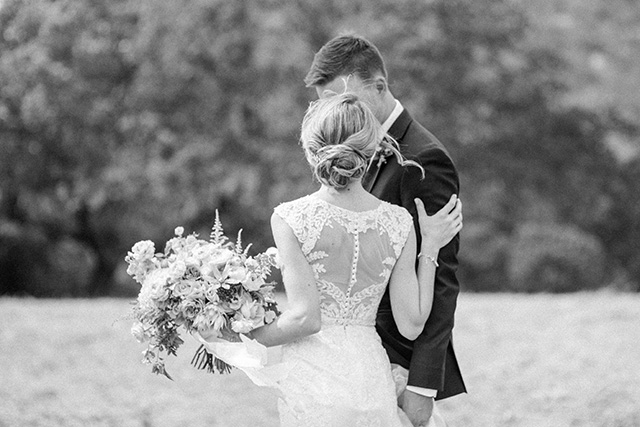
Enjoy our black and white photos from our wedding day-- some of my very favorite!


Photos: The Poffs 


See more of our wedding related posts here!

xoxo


interior design website / services / portfolio
0

Our Living Room Builtin Reveal

At the top of my list of priorities for our new house renovation was getting the living room in better shape. Right away I knew we needed builtins around the fireplace to create a substantial focal wall. You can see in the below before photo that the fireplace looked small, short and DIRTY haha! There was also no ideal place to put the TV because above the fireplace wasn't wired for it. While some people don't love the idea of putting a TV over the fireplace, but I actually really like it if this is the only room for your TV. Instead of creating two focal points in the room (one with the fireplace and one being the TV area), you can hone in all your focus on one spot by hanging the TV over the mantle. This is what we opted to do and I'm so glad we did.

Here's the before:


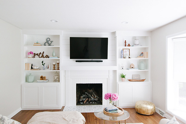
And here's the AFTER! We hired a local woodworker named Jason Bradley to create these builtins for us. For his first set of builtins, they're awesome! He installed them then I caulked every seam and painted them (a whopping 4 coats, including the primer!) The first two finish coats I was using the wrong paint, which my kitchen cabinet painter told me when he saw me doing it. I would have only needed 2-3 coats if I had used the right paint right from the start so it covered everything and the wood didn't soak it all up. The paint he suggested was Sherwin Williams Emerald. We matched the white of the builtins to the white of our trim. 

We opted for closed storage on the bottom half with shelves up above for displaying decor. I took these photos back in June, which is why you'll see the peonies ;) I still need to get hardware for the bottom cabinets, but I've decided on glass knobs! I'm thinking these or these hexagon knobs. 

Once the builtins were in, we had an outlet installed above the mantle. Then my husband installed some 2x4 framing and then nailed in the shiplap to the 2x4's so that there would be something to nail it into but also so the outlet would have a space to sit behind the tv (our exterior wall is brick, so it couldn't go directly in the wall). Once the shiplap was up I painted that. Our builder also built a new, sleek mantle without as much fuss as the old one. I wanted something much simpler and I'm so happy with this one! Can't wait to hang some stockings!!

You might remember I stenciled our fireplace mantle and showed you how in this post! I'm so happy with it and glad to report it's holding up great!


The other thing we did (and by "we" I mean my husband ;)) was install can lights in the room. Before we had no overhead lighting and now we have 4 recessed cans on a dimmer and they make such a huge difference!! We centered the 4 lights on the bay window and it turned out great.

Here are some close ups of the builtins and our decor. Stay tuned for Thursday when I'll show you some styling tips for bookshelves-- I took photos this weekend and I'm excited for the post to go live this week because I'm showing you the right and wrong way to style your shelves. Hopefully it'll be really helpful!


One more time...

BEFORE: 


AFTER:

In this room we still have a couple things left to do:
- New larger rug with some color (blues!)
- Wall art for the wall with the ladder
- Bench cushion for the bay window bench
- One day we'd love a larger couch, but we're fine with ours for now :)


See you back here for Thursday's bookshelf styling post!

xoxo


interior design website / services / portfolio
1

Back to Top