Finished Lake House Design Project

Last week I showed you a peek at the progress on my client's lake house project (only calling it that because it sits on a lake, but we're not going "coastal" for the style). This is my first solely male client, so it's been exciting to push myself outside of what I usually do. The homeowner is also the builder of the house. It's been so great to learn more from him about the entire building process!

Well, the house is finished, so before furniture was moved in, I brought my camera in to take some pictures of my favorite rooms. First up is the kitchen...

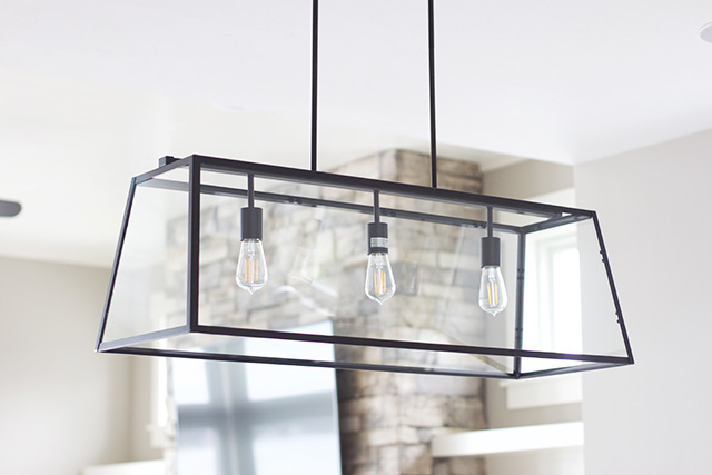
We went with black light fixtures, a neutral quartz, crackled backsplash, white cabinets, brushed nickel pulls, and roman shade over the kitchen window to add texture.

Pendant lights found here.

The window treatments in the house are from Gotcha Covered, who I always LOVE working with!


The dining light fixture is really cool. It can go modern or transitional. The black ties in with the black door handles and hinges around the house.


 Through the kitchen is the dining room, then the family room, which are all open to each other. The shiplap treatment on the ceiling above the family room gives it a little something extra, since the ceilings are raised a foot higher in there.

As you can see below, we installed solar roller shades on the windows facing the lake. They shade light coming in, but you can still see outside. We didn't want to neglect that beautiful view! They're on a remote control...love it!! Today I'll be decorating those custom built-in shelves on either side of the fireplace you see there.


I love this wood beam for the mantel, along with the beautiful stone we picked.


These are the rugs we're doing for the spaces. The left is the dining room rug and the right is the family room rug. 

I think it's going to look great with the fireplace tone! We definitely need some pattern in here to liven things up.


This board and batten accent wall continues to be one of my favorite details. With the dark wood furniture against it, it really makes it pop.

Master bathroom: vanity light found here

This shower is so, so cool! All the tile in the bathroom is the same color way, just different shapes to create interest.

The right picture is the wall stripe detail and the left picture is the floor.

This is the view from the bedroom to the family room:

Going up stairs, there are two formal bedrooms and then one "bonus" room, which is a kid's bedroom for my client's grandchildren. To complete the upstairs is a bathroom.
 Kids bonus space:

Upstairs Bathroom: light fixtures found here

I really love the floor in this bathroom! Since it's for kids, the material is actually linoleum. I couldn't believe I loved it so much!

Soon we'll be taking pictures with furniture in the house, so I'll be sure to share those as well. Thanks for taking a look!

If you're interested, you can follow along on instagram stories today as I style the built in shelves!
xoxo


interior design website / services / portfolio
2

Fixer Upper's Garden Design & Spring Faves at Hearth & Hand

Hey friends! Hope you enjoyed your weekend. My husband got sick on Saturday morning, so I took Lincoln over to his dog brother's house to have a play date. His brother's owner is one of my design clients and I just adore her, so it was fun to see her, chat about their family room design, and play with the pups. We also gave Lincoln a little (much needed) face trim. Doodles' rapid hair growth is no joke, guys!

Well we've got some sun in the forecast and there are no days with temps under 40 degrees in the 10 day forecast, so I'm beginning to get semi excited about Spring! Its IS Michigan, so it could always change (like my Grandma says, just stick around 15 minutes and the weather will change here ;)) But peeks of sunshine, combined with watching one of the latest episodes of Fixer Upper this last week has Spring on the brain. AND! Easter is only 4 weeks away, which is seriously crazy to me! 

Did you guys catch the episode where Chip and Jo built and created their garden and garden "shed"? Shed is in quotes because....did you see that thing?! It's half the size of our apartment and pretttyyy nice! ;) There were so many elements I loved about the design, I thought I'd share some highlights. That led me to checking out a few of their new items in the Hearth + Hand collection at Target, so my favorite picks are below.

Here's that "shed" they built ;)

The outside garden area is so adorable, quaint and charming. Almost looks like it's pulled out of the European countryside. 

Have you noticed that JoJo sticks to a lot of the same design principles on any given project? I love that she knows what she likes and what works. I also love that this season she's stepping a bit out of her usual design comfort zone and not boxing the home designs into the over-the-top shabby chic / farmhouse styles. There are still elements of this, but it's not in your face. She still uses the same principles, like wood and metal elements, simple decorations and big windows, but she's really making sure to highlight the style the couple / family loves.

Some takeaways from this charming space: 

- Go BIG with windows. Don't be afraid to chose a window with a design in the pane. Notice how all the windows in the space have this unique diamond lattice pattern. 

- Go BOLD with light fixtures. I always tell my clients lighting is like the jewelry for your home. For greater impact, she went with two of the same light fixtures.

- Don't be afraid to mix metals and finishes. You'll see the matte black faucet, brass/bronze light fixtures, darker concrete counters with a lighter concrete sink, varying light / warm wood tones, and lots of other textures seen in books and pots. The rule of thumb in mixing metals and texture like this is to make sure each element has a "buddy". So the matte black found in the sink is also found in the hardware on the sliding bookcase ladder and the knobs on the potting station drawers. See how that works?! It's also important to chose a dominant metal and then accent metals when mixing a few different tones. 

- Don't skimp on greenery! This is one of Joanna's very favorite ways to decorate, have you noticed? Most of her decor in Fixer Uppers consist of vases and jugs that are filled with lush, beautiful greenery. Most of the time they're faux! Chose a real-looking faux plant or get low-maintenance living plants to help make your home come alive and look more vibrant.


 Photos: Jennifer Boomer

Watching this episode of Fixer Upper got me curious about the new things in the Hearth & Hand Collection at Target. Like usual, they are super simple pieces that will blend with your current decor. This season there's even a few Easter-inspired pieces :)
SHOPchandelier / metal vase set / rattan wall art / succulent cutting / eucalyptus cutting / brass floor lamp / clear glass goblet / egg tray / bunny ear egg holder / jade glass cupcake stand / vases and jugs


Did you see this episode where they designed the garden?! My friend Ashley has watched it twice because this will be her second summer growing her own garden and this year she's expanding it. She got lots of great ideas and inspiration from Jo!

Have you checked out the spring collection for Hearth & Hand? If you got anything, let me know what!

Happy Monday!
xoxo

interior design website / services / portfolio
2

Hair Tutorial: Everyday Curls

Photo by Ray Anne Barker

One of the most frequently asked questions I get is how I curl my hair, if you can believe it! I thought I'd give you a little video tutorial of how I do this-- hopefully it helps. Just to preface, I have pretty thick hair, with a bit of natural waive, which I try to blow dry out when I'm drying it. 

Before I blow it dry, I use: Aveda's Smooth Infusion, making sure to run it through my entire head of hair (but trying to avoid the top, where it might get greasy) then Surface's Bassu Oil, which is one of my favorite hair products EVER! Also makes great shoulder massage oil. I run this through only the ends of my hair, before and a little after blow drying.

Once it's all dry, this is how I curl it! The most important thing to note is how I unwrap my hair when I release the curl. I twist it around itself as I release to give it more of a curl. The other important note is that I hold the curl in my hand for a few seconds to let it cool and "set". Finally, I don't run my hands through my curls until after I it's all had a chance to cool.

I use the Hot Tools curling iron (1") and have for YEARS. It's on sale now!

After I run my fingers through it, I finish it off with a touch of hairspray. I'm using DryBar's right now and really liking it. Also, I can usually go 3 days without washing my hair. I had to train my hair to do that-- it used to be only 2 days. But the longer you go without washing, the more your hair learns to control its' oils. Funny how that works! On the second day, I recurl it if I need it and then on day 3, I usually do a ponytail or half up / half down.
This is just the way I do my hair, certainly not right or the only way ;) Let me know if you have any questions!
xoxo
interior design website / services / portfolio
0

Saturated Pink & Magenta Wedding Inspiration

You might have seen some sneak peeks of this photo shoot we designed for The Bloom Workshop last year in Chicago over on my Instagram last week, but I had to share the whole thing here since it's just so gorgeous! And perfect for the month of February ;)

At each Bloom Bash workshop, Ashley and I design and style a stunning inspiration shoot for our attendees to practice photographing and styling themselves, to then add to their portfolios. This was our first ever all-indoors venue / shoot, so we were nervous about it. But thankfully, the light poured in these tall windows and gave us some pretty gorgeous photos! We were so honored to have it featured on Inspired By This last week. Hope you enjoy it, and if you're a bride-to-be, maybe you can take some inspiration from it for your big day. I'm in love with this bold and saturated color palette!

Speaking of that, I'd love to run a wedding series this year for those of you planning you wedding! Hit me with your questions in the comments or drop me an email :)


ARTIST TEAM: 
Florals: Fleur
Invitation Suite: Molly Jacques 
Wedding Dress: BHLDN 
Rings: Suzie Saltzman 
Suit: The Black Tux 
Goblet & Cake Stand Rentals: Nimble Well 
Furniture & Plates: Chicago Vintage Weddings 
Cake: Root Cakes 
Hair & Makeup: Nika Vaughan Bridal Artists 
Event Concept + Design: Michaela Noelle Designs & Ashley Slater Photography of The Bloom Workshop


If you want to learn how to style and execute a styled shoot, learn how to take beautiful pictures, or hone your styling abilities, we'd love to meet you at one of our 2018 Workshops!


interior design website / services / portfolio
1

Back to Top