Our Living Room Builtin Reveal

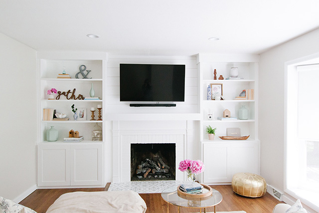
At the top of my list of priorities for our new house renovation was getting the living room in better shape. Right away I knew we needed builtins around the fireplace to create a substantial focal wall. You can see in the below before photo that the fireplace looked small, short and DIRTY haha! There was also no ideal place to put the TV because above the fireplace wasn't wired for it. While some people don't love the idea of putting a TV over the fireplace, but I actually really like it if this is the only room for your TV. Instead of creating two focal points in the room (one with the fireplace and one being the TV area), you can hone in all your focus on one spot by hanging the TV over the mantle. This is what we opted to do and I'm so glad we did.

Here's the before:


And here's the AFTER! We hired a local woodworker named Jason Bradley to create these builtins for us. For his first set of builtins, they're awesome! He installed them then I caulked every seam and painted them (a whopping 4 coats, including the primer!) The first two finish coats I was using the wrong paint, which my kitchen cabinet painter told me when he saw me doing it. I would have only needed 2-3 coats if I had used the right paint right from the start so it covered everything and the wood didn't soak it all up. The paint he suggested was Sherwin Williams Emerald. We matched the white of the builtins to the white of our trim. 

We opted for closed storage on the bottom half with shelves up above for displaying decor. I took these photos back in June, which is why you'll see the peonies ;) I still need to get hardware for the bottom cabinets, but I've decided on glass knobs! I'm thinking these or these hexagon knobs. 

Once the builtins were in, we had an outlet installed above the mantle. Then my husband installed some 2x4 framing and then nailed in the shiplap to the 2x4's so that there would be something to nail it into but also so the outlet would have a space to sit behind the tv (our exterior wall is brick, so it couldn't go directly in the wall). Once the shiplap was up I painted that. Our builder also built a new, sleek mantle without as much fuss as the old one. I wanted something much simpler and I'm so happy with this one! Can't wait to hang some stockings!!

You might remember I stenciled our fireplace mantle and showed you how in this post! I'm so happy with it and glad to report it's holding up great!


The other thing we did (and by "we" I mean my husband ;)) was install can lights in the room. Before we had no overhead lighting and now we have 4 recessed cans on a dimmer and they make such a huge difference!! We centered the 4 lights on the bay window and it turned out great.

Here are some close ups of the builtins and our decor. Stay tuned for Thursday when I'll show you some styling tips for bookshelves-- I took photos this weekend and I'm excited for the post to go live this week because I'm showing you the right and wrong way to style your shelves. Hopefully it'll be really helpful!


One more time...

BEFORE: 


AFTER:

In this room we still have a couple things left to do:
- New larger rug with some color (blues!)
- Wall art for the wall with the ladder
- Bench cushion for the bay window bench
- One day we'd love a larger couch, but we're fine with ours for now :)


See you back here for Thursday's bookshelf styling post!

xoxo


interior design website / services / portfolio
1

Client Reveal: Cozy, Textured, & Bright Michigan Family Room

Hi friends! I'm back in town and back in the office and it feels good. I'm excited to get back into a blogging a bit more, after being away for two weeks. I've been looking forward to showing you the reveal of a client's house for a few months now. This house was finished back in October and was featured in the Parade of Homes here in Grand Rapids, MI. It was such an honor to get to design and work on this house with my clients!

Today we're starting in the family room, but first I'm showing you how cute the front door and wreath are, because I can't help it! Hope you enjoy the tour...

 (You can use the code MICHAELANOELLE for 10% off any order on your next wreath!)


The great room opens up to the dining area and kitchen, which I'll show you another time. This family room feels nice and airy with help from the light wall color, tall ceilings with shiplap inlay, and the big windows with white curtains (and these roller shades have my heart!). The continuous hardwood floor throughout also helps the space feel open and large. 


We did a beautiful stone fireplace and hung the TV above the mantel so we could get symmetrical builtins and floating shelves on either side of the fireplace. The cabinets are amazing storage for this family with 2 young children and all the decor on the shelves is up high so they can't get to it ;)


I kept the decor on the shelves neutral and pretty simple, pulling in tones from the rest of the house.


While the decor on either sides are different from each other, they are still balanced, which is the most important thing when accessorizing your shelves! You can get a tutorial on how I do that HERE. On this side, we did a lantern, some brass candlesticks, a couple vases with wood beads on one, books, some greenery and the cutest "home" sign from Feather & Birch. I adore them!! (sorry most of these items aren't available online!)


The one item I did on both sides was this whitewashed metal square piece, so that there was some continuity. The other repeated elements were the blue color in both vases and greenery.
 It was fall, so we added a gold pumpkin ;)


Pretty blooms by my friend Melissa Anne Floral Co.

Tray / coasters (similar)


Here is the view standing in the family room facing the front door. I'll show you more of the entry another time!


Here's the view from dining room looking into the family room:


Steve Visser Builder / Wall Color: Collingwood BM / Flowers:  Melissa Anne Floral Co. 

I actually learned how to take these interior photos myself. I was pretty proud of how they turned out, considering this was my first real try. I think as a designer, it's a great skill to have to be able to capture your own work!

Hope you enjoyed the tour of this pretty West Michigan family room. It was fun to combine some modern farmhouse touches with a couple more traditional elements as well.

xoxo

interior design website / services / portfolio
*affiliate links used
3

Client Reveal: Light & Airy Michigan Family Room & Kitchen

Hi friends. Phew! I got knocked out with the flu (aka my worst nightmare) on Monday and then was down again all Tuesday from body aches and sheer exhaustion. So thankful this happened on two severe snow days here in Michigan, because appointments were already canceled. 

Anyways, I'm so excited to be sharing this client design reveal with you today! I love all of my clients (really, I do!) but this one has such a special place in my heart. We met through our dogs and I feel like she's become my Michigan mom of sorts, which is really special since my own mom is in California! She's so kind, always checks in on me and I know she'd be there for me in a heartbeat if something ever happened. 

This reveal of their family room, dining, and kitchen seriously makes me so happy! She came to me asking for help with her house, after another interior designer helped them redo their kitchen, except it wasn't anything like what she wanted. This just makes me so sad! My main goal as a designer is to have my client's LOVE their home. This client told me she wanted "a light, bright, and airy home just like I see on your instagram" (so sweet!) We went to work!

Problem #1 was that the paint color was way too dark for their house and because of their several skylights, the paint color though it was technically a gray, always looked green. We found the perfect color in Stonginton Gray (but toned down to 75%) to achieve this airy look. Because it has an undertone of blue, on their walls with the skylights, it appeared a solid, neutral gray. Hooray! We also replaced the carpet for LVP (luxury vinyl planking) throughout the whole main living area which made it look so much larger. We got lots of new furniture, but still kept some of their current pieces, too! 

Ready to see the before?!


And now the AFTER!


Their beautiful new rug took a while to find, but once we landed on it, it brought so much clarity to the space! Her husband didn't want something too light, and since they have dogs, we agreed it couldn't be a loop rug or anything solid. This has just the right amount of pattern and color. We pulled some blues from the rug into the sofa pillows, the lamps and other elements in the kitchen.


Now for the before of the fireplace wall. My client didn't like her stone selection at all because it felt too dark. I told her to trust me-- once we found a better paint for the walls and paint the mantel white, remove the hearth tile, she'd like it better. And if not, we could always replace the stone after.

No need to do that, because she loves it now! And I do too. It actually helps to bring warmth and texture to the room. I pulled up some of the warmer tones into the candlesticks on either side of the mantel and added a touch of green to keep things fresh. 

One thing that's important to note is that because they have such tall ceilings, we needed to bring height from the ground up, not just hang things on the wall. So in addition to the large mirror over the sectional, I also brought in a taller plant, used a lamp they already had that worked with the space to help them save some cost, and immediately, the room started looking more proportionate. 

This arm chair was sourced by the previous designer, and since it was costly, we kept it and made it work. In their previous room, it felt dark and drab, but now it's really sweet and seems a lot brighter!

We got some custom pillows made for her sofa to coordinate with the rug colors and I LOVE them! It's a whimsical and fresh floral, perfect for the room.

I love the nailhead detailing on the sofa!


What's a room without a fiddle leaf tree?!


Curtains hung higher over the windows is a sure way to draw the eye up and give height to the room. It's also such a nice, soft finishing touch!


In the entryway we added a console table with a pair of lamps for ambient lighting, a basket for dog treat and leash storage, and two poufs for extra seating. It's come in really handy!


The wall between the kitchen and living room got some much needed art, adding colors seen throughout the rest of the spaces.


We kept the old recliner and it looks just fine now sitting next to one of my favorite pair of nesting tables. They work in almost every space! 


Okay, now onto the kitchen reveal...

When someone says bright and airy kitchen, I can't believe that this small, dark glass tile is the first thing you think of?! Ha! No judgement, but I think I had a bit better idea of what she wanted :)


We painted the cabinets white, changed the tile out for a beveled subway tile and light gray grout, installed new quartz countertops and a new sink. We also got new cabinet knobs and pulls, making it feel like a totally new kitchen!


The dining space got a new table and chairs, but we did keep the buffet and it looks so much better now!


I walked into a local store and found this piece of art that I knew would be perfect for their dining room. It tied in all the colors so well! A couple accessories and we were all set.


A few sources for you: 
Paint: Stonington Gray at 75%


I hope you've enjoyed this reveal! It really shows the power of paint, doesn't it?! The best part for me is knowing my clients absolutely love their new space. She tells me all the time how much more it feels like home to them, which is so sweet. 

Happy Wednesday, all!
xoxo

interior design website / services / portfolio
9

Back to Top