General Rules of Design

Do you ever google questions relating to design? Like, "how high should my chandelier hang above my table" or "how do you mix pillow patterns?" Hopefully this post will help compile a lot of your Frequently Asked Design Questions into one place! I've come up with a ton of answers to FAQ's I get, along with a couple I feel like need to be mentioned, then I asked some of my friends to give me their best tips as well. This post is chalk full of quick, practical, general design "rules". (Of course, in design all rules come with exceptions, but these are pretty straightforward and always work!)

CURTAINS:
- Curtains need to touch the floor or even do a slight puddle. If you have 8' ceilings, you'll want to order 96" drapes to ensure they touch the floor. You might have to get them tailored a touch if you don't like puddling, but puddling is better than high waters ;) 9' ceilings? 108" drapes. Anything over that usually will need to be custom made, as big box stores don't typically carry longer than that.

- Hang your curtains as high above your window molding as possible to create the effect of higher ceilings or simply to highlight your windows.'
LIGHTING:
- Chandeliers should be 32-36" above the table depending on your height.

HARDWARE:
- Drawer pulls should be about 2/3 the side of the drawer. On extra long drawers, use two pulls.

MIXING METALS:
- To mix metals, use the buddy system. Every finish you have should have at least one other thing in the same finish. For example, if you have black door handles, tie in the black through black on light fixtures. Slip in some hold in the hardware on the kitchen pulls and maybe a touch of gold in accessories or on the kitchen pendants. 

- Another way to mix metals is to keep the metals the same on every plane. So cabinet hardware might be one finish, while the sink faucet and towel bars are another, and the lighting and plumbing is another. 

WALLS:
- The center of artwork should be hung at about 55-60" off the ground

- Your artwork should be about 2/3 the size of whatever it's going above (a dresser, couch, bed, etc.)

- Every wall does NOT need something hanging on it. There's something to be said for negative space.

- When hanging gallery walls, make sure there are only a couple inches in between each frame. Same goes for if you're hanging two or three pieces next to each other in a row...hung too far apart will not create continuity. Hanging 2-4" apart will make them look purposeful, which is what we want!

- Speaking of gallery walls: these aren't the only ways to decorate your walls! One large piece of art or big framed photo, a fun clock, textured wall art (like this or this), wood signs, letters to spell a word or phrase, succulent wall, a plate collection, or a mirror are all great ideas. Wall sconces are also a great accent on either side of one piece of art!

STYLING + ETC.
- Scale is important. Simply put, big room with high ceilings? You'll need larger scaled furniture to fill it out. Hanging dinky artwork or putting a tiny chair or low couch in a two-story room will make it feel incredibly small compared to the height and grandness of your room.

- Want an easy way to get your duvet in the duvet cover without it bunching? This video is a MUST watch. Thank me later ;) #lifechanged

- Too big of a room? (What a good problem to have!) Creates separate, more intimate spaces by zoning off sections of the room for different things. Like, a cozy reading nook with a pair of chairs and a side table, a TV watching area with a sectional, and a play area with a small kids table. Something (almost!) every "zone" needs is a rug. It'll help clearly define the area and help this big space become more intentional. 

- If you have short ceilings, there are a couple things you can do to counteract that and still make your space feel tall and open. 1. Hang curtains as high up as possible. 2. Build or create the look of built-ins that go all the wall from floor to ceiling. 3. Paint all walls in sight the same color (typically I go light-medium in the case of a short ceiling unless going for a more dramatic look). 4. Get some tall plant(s) for the room to continue to draw your eye up.

- I once heard every room needs a touch of black, and I happen to love the advice and have seen how much sophistication black adds to a room!

- When in doubt, decorate in 3's. This means to group items in 3's (or odd numbers) to create unity, instead of perfectly spacing decorations out. 

- Just like walls, not all all countertops need something. In a kitchen, I think it's great to have one or two "vignettes" depending on the size of your counter space. In my old apartment I had hardly any counter space, but I still did a cute set up on one of the areas. My favorite vignettes would be a coffee / tea station complete with a tray for mugs, a recipe box and cookbook stack, or a pretty fruit bowl or cake stand on top of some books.


We're In This Together:
I've asked a couple designer friends to weigh in with their best design "rules" and suggestions as well, so you don't just hear them coming from me. Read on for more!

From The DIY Playbook...

Make sure your rug is large enough for your space. Bigger is usually better.

- Avoid buying generic home decor. Instead, collect pieces that are personal and tell your story.

- Don't buy an entire furniture set. Mix & match for a unique and layered look.

- Ditch the pillows that come with your new couch and buy new ones with varying patterns, textures, and colors! (more on how to do this below)

From Hannah Matthew Design...

- Layering window treatments adds both form and function to a space. I particularly love layering drapery panels over woven wood blinds.  The options are endless with the drapery hardware, style of woven wood, and drapery fabric, so the combination can really be tailored to fit any space.  There's just something about the look that lends an elegant yet warm and "finished" feel to a room.
via

From Lark & Linen...

- When mixing pillows a good rule of thumb is to have one solid (bonus points for some texture), one small scale pattern and one large scale pattern. Stick within the same colour palette and you'll win every time!
via

From The Inspired Room...

- Using a color three times in fabrics, backdrop elements, or accessory displays creates a cohesive feel in a room.

- An easy interior design equation for your color palette is 60-30-10. The main room color should cover about 60 percent of the room, the secondary color should make up 30 percent, and the accent color is the remaining 10 percent.

- Add white to a darker paint color used in one room to create a new complementary paint color for an adjoining room. Mix the exact same paint brand and sheen of paint to ensure the paint goes on smoothly and evenly when mixed together.

- Layers of pillows will add height and dimension to your bed. For a stylishly layered queen bed, select a combination of at least two Euro-style pillows (big square pillows), two standard pillows with shams, and a center accent pillow. For a playful look, mix patterned or colored shams. Create the feel you love with different pillow fabric textures: grain sack, faux fur, knit covers, or pillows with a surprising metallic sheen.

- A common lighting problem is a room with only one center light that leaves the corners dark and dreary, especially at night. Beyond that primary light and natural light, additional sources can make a big difference! Incorporate variety through table lamps, wall sconces, lanterns, string lights, task lamps, under cabinet lighting, etc.

- I love using indoor/outdoor rugs inside! They are easy to keep clean even with dogs. When they get dirty, I wipe them off with a rag or take them outside and host them down (the rugs, not the dogs!).

*get even more tips in Melissa's books Simple Decorating & The Inspired Room.

From Our Fifth House...

- Always measure your doorways before ordering large furniture pieces like sofas.  There's nothing worse than buying something that you can't get into your space.  Ask me how I know.  ;) 


interior design website / services / portfolio
2

FAQ: How to Choose a Paint Color for Your Home


The other day I was working on one of my client's design projects and it occurred to me how generous my parents were in letting me use their house as an experiment of sorts! Whenever I had an idea, they usually let me try it. I remember painting the guest room headboard wall a coral color as an accent 8 years ago (it was so crazy bold...I can't believe I did it! So glad I have my blog to document this...ha) It is now a nice neutral color. Then I volunteered to take down the old floral wallpaper in our bathroom (bad idea...I cried real tears, it was so hard!) and painted it yellow. Yep. A few years later, I thought a pale blue would be nice so they let me change it. And just last year we all agreed it needed to go more neutral, so it's now a pretty greige color (Malibu Beige by Kelly Moore). My room has been purple (thankfully I don't have pictures of this!), blue and green (so bad), mint green (which I loved!) and now a neutral color as well.

They let me be creative and always supported me and I'll forever be grateful for that! But I'm also so sorry for all the paint color changes ;) Ha! I just had to tell open with that, before I share a few of my best tips for choosing a paint color for your home since I've got years of experience from trial and error. This is one of the most frequent questions I get, along with asking for paint color suggestions (saving that for another post!) so hopefully I can help! This is the process I always suggest my clients follow when choosing paint.


Paint is probably the cheapest way to drastically change the look of your room, so this is one of the first decorating updates to consider! Just wanted to note, paint will look very different on a swatch than on your actual walls. I'm mentioning this because I think people are often surprised by their wall color when it's up if they don't follow some of these tips.

1. Consider the lighting in your space.
Natural light will make the color appear in it's truest form! If you get lots of natural light then you could go a little darker with your paint color and not have it feel TOO dark. Fleurescent lights will cast a blue shadow on your paint and can cause the color to have a blue undertone, while incandescent bulbs will cause a yellow and warm tone to the walls and room in general. 

If you have incandescent bulbs everywhere and no natural light to help balance it out and want to paint your walls yellow, the lighting will only intensify the yellow paint. It might be too overwhelming! Something to think about when choosing colors. If you want to downplay the color the lighting in the space is casting into the room, try to choose a color that will offset the lighting. For example, one of my current client's walls was a medium to dark gray with a subtle green undertone, but with the skylight they had in the room and the way the recessed cans and windows were positioned in the room, the color went VERY green in the afternoon and evening. They hated it and wanted something that would look more like a TRUE gray. So we found a lighter gray paint with a blue undertone to help counteract the green shadows in the living room (Stongington Gray by Benjamin Moore, in case you're wondering!) It worked like a charm and now they love their wall color.

 BEFORE:

AFTER:

If you love the HUE of a color, but think it's too light or dark, you can actually get it lightened or darkened by the paint store. For example, this Stonginton Gray paint above is actually at 75%, because the true hue was a little dark, which we were trying to avoid. 

2. Consider the mood you want to set.

Warm colors like red, orange, yellow, coral, beige peach, or anything that has those undertones, tends to make a room feel more intimate. Cool colors like blue, green, purple, and grays with cool undertones tend to make your space recede and feel larger. I could do a whole separate post on color psychology, but for now, I'll keep it at this: every color comes with a slew of psychological pieces to it that you might want to consider when painting your walls! 

A neutral backdrop for black and white touches throughout...

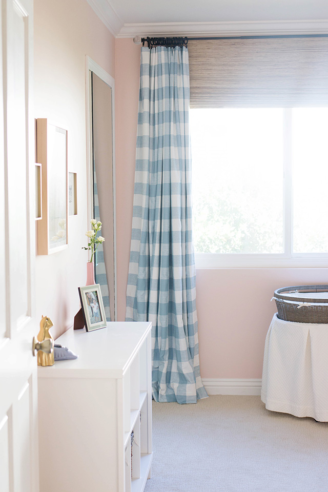
or a seaglass blue on the walls for more punch....

3. Consider the function of the space.

This is more to help you figure out the sheen of the paint you'll want. If you have kids, you'll want higher sheens for cleanability. If you get a ton of traffic in your house you'll also want a higher sheen. 

Flat (no sheen, hardest to clean)- Matte - Eggshell - Satin - Semigloss - Hi-Gloss (highest sheen)

For public spaces like family rooms, kitchens and hallways, eggshell or satin is great. Bedrooms can also go eggshell or satin, but some people prefer semigloss because it's easy to clean because of the high sheen. For trim, doors and molding I suggest satin or semigloss (but typically lean to semigloss). For bathrooms, I usually do satin or semigloss. Ceilings are flat. 

3. Once you have an idea of a few colors, put them to the test.

This is the most important step! I BEG YOU to try out the paint on your walls or hold up huge samples of the color on the walls. This is the only way you'll know if the color will work or not. I have my clients get samples of 2-3 colors we're considering, put them in big swatches on different walls in all the rooms so we can see what the light is doing to the color in the actual space. We leave them for a day or two and then make our final selection.

Another note here: anytime you're selecting materials or paint for your home (cabinets, backsplash, countertops, etc.) it's imperative that you hold the sample in the correct orientation to see how it looks. In the case of paint, you'll want to hold the paint swatch up vertically on the wall as opposed to holding it flat in your hands. To get the full effect, you need to see the color in the orientation it will actually be in in the space. Backsplashes you'd hold vertically, while countertops you'd lay horizontally...make sense?!

4. Don't overwhelm yourself with too many options! 

This is one of the biggest mistakes I see in my clients if I come in halfway through a project because they realized they can't do this alone. Often they are deciding between 10 shades. Look, there's no way you'll be able to make a decision between 10 shades that are so similar! I always suggest a max of 3-4 colors going up on the walls to decide between. If you hate all of those options, THEN go back to the drawing board and get a few more options. 

5. Consider the function of the space & how to add dimension.

Once you've decided on colors, it's time to nail down the sheen. If you have kids, you'll want higher sheens for cleanability. If you get a ton of traffic in your house you'll also want a higher sheen. 

Flat (no sheen, hardest to clean)- Matte - Eggshell - Satin - Semigloss - Hi-Gloss (highest sheen)

For public spaces like family rooms, kitchens and hallways, eggshell or satin is great. Bedrooms can also go eggshell or satin, but some people prefer semigloss because it's easy to clean because of the high sheen. For bathrooms I usually do satin or semigloss. Ceilings are flat. 

To add dimension I like to do the trim, doors, and molding in a higher sheen. I suggest satin or semigloss (but typically lean to semigloss). If you're painting a room all white, it's a good idea to use a different sheen, like eggshell on the walls, and the same color but in semigloss for the molding, to create that dimension!

6. Create flow with the rest of your house. 

Do this by making sure the colors blend from room to room. One way I do this is usually by painting the walls a neutral color and accenting with pops of color in the fabric choices, pillows, curtains, artwork, and accessories. Like my client's house example above, we have gray walls with some blues and greens through the rug and the pillows (coming soon). Even though the kitchen is a separate room, they still need to flow together, so we will be bringing a few touches of blues and greens to the kitchen as well, but can also add in other colors as accents if we wanted. Just be sure to pick a dominant color that you might see in a few places throughout your home, but then each room can have it's own accents. 

Hopefully these tips help you in selecting a paint color for your home! Let me know if you have ANY paint color questions. I'll be sure to answer them in my next paint post!
xoxo

interior design website / services / portfolio
6

Designer Files: Julia Ryan Creates


I'm excited because today is the first edition of my new series, Designer Files! In this series, I will ask some of my favorite designers and other artists some fun questions for us to get to know them better. You'll want to keep reading and meet Julia, because this girl is a talented interior designer and she's got some great design tips!


Meet Julia, of Julia Ryan Creates!


What is one of your favorite home projects or pieces in your home?
My daughter's big girl room is by far my favorite room.  It got a complete makeover about a year ago and it's still the most finished and prettiest room in our home.  Being in there makes me so happy. 


How did you get into design?

I've always had an interest in interior design.  Long before HGTV and blogs made home design accessible to the masses, I always found a way to make my surroundings feel pretty and a reflected version of how I saw myself.

Stripes or plaid?

Call it rebellion from 13 solid years of wearing a plaid jumper or skirt but just I can't do plaid. Stripes feel bold and casual and less stuffy to me.  The exception, I do love a good tartan accent at Christmas.


Geometric or floral?

As much as I love a good floral print, I almost never chose it for myself.  I much prefer a graphic print.

Symmetry or asymmetry?

symmetry.  I feel a big need for things to match or come in sets.  I'm working on that casual and balanced look you can only achieve with a little bit of asymmetry in my own home because I love the look.  But I struggle with it.

One decorating "rule of thumb" is:

Buy only what you love.  Every inch of your home is valuable real estate both financially and emotionally. Don't let your house fill up with wasteful items that don't serve a purpose or bring you joy.  Get to the bottom of how you want your home to feel and stick with that plan.

I couldn't live without _____ in my home.
Am I allowed to say tv here?  I'm going to say televisions and blankets.  I am a huge fan of watching tv and see zero point in trying to hide or decorate around a tv.  It's a big part of my life and I'm not going to hide that from myself or others.  Also, as much as I like a good show on Bravo, I'm an avid reader.  Nothing makes me happier than cozying up with a book and a blanket.  I keep faux fur throws on almost every surface in every room.


A design don't:

Following design trends or buying things just to fill up a space. As nice as it is to have a room "finished" if it's not really a reflection of you or how you really live then what's the point.  For instance, I LOVE the look of pretty wood lockers in every single picture I see them in but that would drive me crazy in real life to see a bunch of things piled on hooks and not hidden behind doors.  Sames goes for open shelving in the kitchen, I love the look but it's not for me.  Figure out what makes you happy.

What is your favorite spot in your home?

My bed.  I am totally a sucker for a really cozy bed and serene bedroom.  I love to go to bed early and watch tv or read.  That's my haven. 


What has been one of your biggest design challenges?


money money money money. No really. I think being so hyper-aware of what's in style and what's available and what projects you can tackle can really be a disadvantage sometimes. I have to remind myself that working with what I already and within the constraints of a budget is normal and beautiful homes don't need to be created over night. Also, styling my house for the life we actually lead and not just a design showroom is hard for me, but I'm getting better at that every day. I never want my husband or kids to feel like they can't relax and be themselves in our home. Because, isn't' that really the whole point?

***

I love Julia's point about decorating for the life you actually lead. I think when we give ourselves permission to do that, we can just take a deep breathe and remember who and what is important in life. Visit Julia Ryan Creates today for more decor and fashion inspiration!

Happy Thursday!
xoxo
Photobucket
7

Back to Top