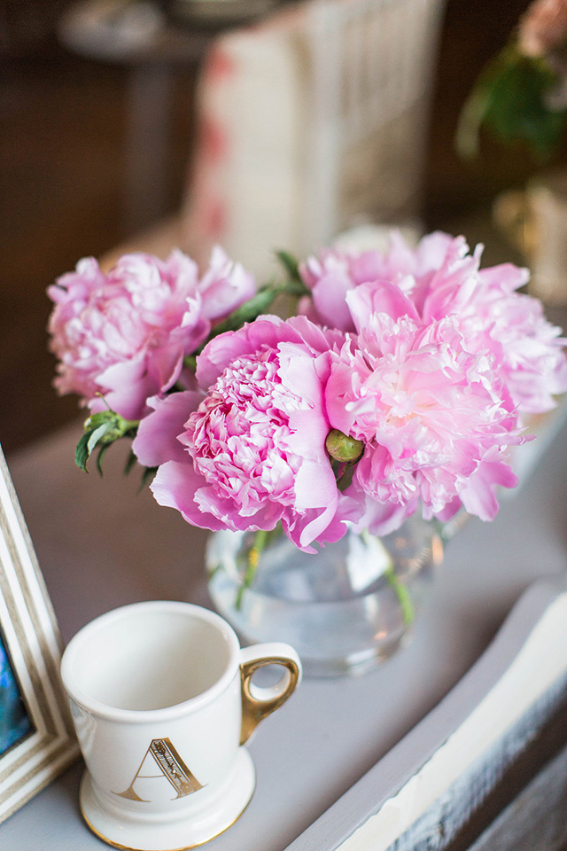
Favorite Editing Apps for Photos & Instagram

Ah, instagram. Everyone's favorite (well, maybe it's a love-hate relationship) form of social media! I think it's so fun to be able to share pictures like this. Especially for people and family across the country-- it's a great way to stay in touch, up to date, and honestly, it's been a great tool to market my business. Sometimes I get questions about how I edit my photos, so I thought I'd share some of my favorite editing apps for photos. Hopefully they're helpful!

I always recommend taking photos in bright, well-lit spaces when possible. This makes getting like-worthy photos that much easier and any filters or editing techniques you apply will look clean and beautiful. I also suggest you always take photos with your phone camera and not from within an app. For some reason, the app cameras distort it. A few of my favorite apps are Afterlight, VSCO, Lightroom and A Color Story. Here is the skinny on each:


Afterlight: Think of this as photoshop on your phone. You can adjust exposure, brightness, clarity, contrast, temperature and more. Here's an example of a photo edited with Afterlight. 

BEFORE:


AFTER: You can see it's taken in the shade, on a bright sunny day, so the lighting is ideal. To make it really pop, though, I did a few things in Afterlight, like up the brightness, sharpen, increase the saturation and contrast.


VSCO: I love VSCO because of the clean photo filters they offer. I recommend HB1, HB2, A6, & C1, 2 and 3. Always adjust the opacity on any filter you add and remember that true-to-life color always stands the test of time. You adjust the filter by double-tapping it then sliding down the bar to achieve a less-filtered photo.

Here's an example of a photo edited with VSCO. BEFORE:

AFTER: Adjusted the brightness, contrast, sharpness and applied filter A6 at level 4 opacity. Finally, we adjusted the temperature to a bit more of a blue hue, because the picture had inherently yellow tones due to the flower color.


A Color Story: This app is all about color, as the name suggests! A Color Story has all the editing tools for adjusting brightness, contrast and sharpness, as well as MANY fun filters (my favorites are the pack created by Glitter Guide called Flashes of Delight) and lots of flares, bokehs, and other effects. This app is probably the most "overwhelming" of all, because there are a lot of options.

Here's an example of a photo edited with A Color Story. BEFORE:

AFTER: brighter and more saturated.

I also want to show you how cropping your image more closely can create more interesting and vibrant pictures. Removing some negative space and cropping it closer, draws you further into the petals of the flowers and cuts out some of the darker background:

Lightroom: My latest photo-editing obsession is Lightroom because of the presets I just downloaded. I saw everyone posting about Monika Hibbs presets and loved how they looked, so I caved and I'm SO GLAD I did! They're so clean and make your photos bright and airy, without blowing them out. I rarely have to adjust anything else after applying her presets. You can find them here. I just got the pack for the Lightroom PHONE app, but she has them for phone and desktop. Once you purchase them, it emails you instructions on how to  download and use them. 

BEFORE: it's important to note the lights are turned off here so I got even natural light. If I had taken it with lights on, when I applied the filter in lightroom it would have blown out certain parts of the photo (overexposed) and made certain parts where the lights hit feel extra yellow.


AFTER: I used the "cream" filter on this to pull out the greens a little more than the others would have. I didn't adjust anything else!

Our Editing Tips:
I almost always increase our brightness and contrast when edited in any app (unless the preset does it for you!) I also like to slightly bump the clarity and sharpness. If our photo is too yellow or too blue, we also adjust the temperature for the perfect color. Doing these things reduces the need for photo filters and achieves a bright and airy style. 

The biggest thing, though, is to find your style and be consistent with it. I try to edit my photos very similarly so that it helps create a cohesiveness with my brand. Just like I wouldn't share a photo of a mid-century-modern interior style (because it doesn't reflect my style) I'm also not going to share a super dark, poorly lit, or highly contrasted image. You need to find YOUR personal style and work on developing the editing that reflects that in your favorite app. Most apps have the ability to save your previous adjustments so you can apply the same adjustments to each photo with just one click. It helps speed up the process!

I hope these tips and before & afters were helpful. Let me know if you have any questions in the comments!

xoxo


interior design website / services / portfolio
0

How to Pick Outfits for Family Photos


Ah, the art of picking out outfits for family photos! So far I've only had to put together outfits for the two of us (well, three of us, if you count Lincoln-- which obviously I do!) but I can imagine it being even harder with every added person (or fur baby). Though challenging sometimes, I actually love putting our outfits together and since it's Christmas card season, I thought I'd give some pointers since we just took our photos and got our cards all ready from Paper Culture. I just love getting Christmas cards in the mail...snail mail is the best! 

For our engagement photos, I wanted us to wear things that were in the palette of our wedding so we could use them for anything regarding the wedding-- save the dates, our wedding website, photos to print for the wedding, etc. 

First I ask myself if I want the photos to be formal or casual, and for this shoot I wanted one set to be more formal and the other to be more casual. Our palette was lavender, blush and navy, with lots of neutrals, so I started with my floral lavender dress and built McCann's outfit around mine. That's usually how it goes ;) I love some contrast, so I had my husband dress in dark gray slacks. I love the depth it adds here.

For our more casual photos, I went with a neutral white dress with cut out details. I love this dress so much and always feel like white photographs so well! I had McCann pull in the navy, but added pattern in the subtle polka dot print of his shirt (which you can barely see in this picture).


For our California engagement photos I also kept within the wedding color palette! I started with my lilac colored sweater, though solid, had a pretty lace detail on the back and texture in the knit. I went dark jeans on the bottom and then put McCann in light pants and a chambray button up. This was also a very casual look. I think it's pretty classic though!


Now for our last year's Christmas card photo I wanted to go bold with some pattern. I found the dress I wanted to wear first (of course ha!) then built McCann's outfit around it. I wanted this to look very "fall" and wanted to play with pattern. One solid pattern combo that never fails is floral + geometric. The thing that makes this fail-proof, though, is the scale of both patterns. My floral pattern dress was very large-scale, so I went with a small-scale geo pattern for my husband in a coordinating color (not matching!) then to make sure it wasn't too crazy, layered with a cool vest. Layering pieces is one of my favorite things-- it just makes the outfits look even more thoughtful! 


I wanted Lincoln to wear a scarf (because #crazydogmom) so I found a fabric that pulled out the blue/green from the leaves in my dress. It had a slight polka dot pattern which was also a small scale, complimenting everyone else's attire.


THIS year for our pictures I also wanted to wear a dress. I already had the perfect one that looked Christmassy and thought layering a fur vest on it would be fun! With my red plaid being pretty bold, I wanted McCann to be in a solid but with some detail, so I found this chunky sweater. And the fur vest definitely helps tone down the pattern of my dress! Of course Lincoln is wearing a bow tie and that is also plaid, but heavier on the black color with a hint of red, so it works perfectly. It's also a smaller scale than my plaid. 


I also found this nice sweater for my hubby, so I had him change for the sitting photos and love how it looks!
All photos by Ashley Slater Photography except our California engagement pictures by The Poffs

I can't wait to show you our Christmas card photos, once everyone on our mailing list gets theirs in the mail! We used Paper Culture this year and I absolutely loved them!! 

A couple quick tips:

- Start with the person's outfit that has pattern and work off of that, pulling coordinating colors from it.
- Remember the scale rule of thumb. If one pattern is large-scale, the other pattern should be smaller-scale. Throw in some solids to break it up.
- Avoid logos or cartoons (unless that's your thing! :))
- When thinking of backgrounds and settings, think of how you want your card to feel. Last year I wanted it to feel very fall so we did an open field in the middle of fall color. This year I wanted a neutral background, so we actually went to a cemetery with a marble building! I love the green trees behind us in that one picture up there! You'd never know where we were.
-  I love dressing up a bit for photos and I love dresses-- it's what I feel most pretty in. So I say, wear a dress! Or whatever you feel best in:)
- Try to avoid "matching" and instead make "coordinating" the goal. For example, you don't all need to wear blue jeans and a white button up. That's really extreme matching. You don't even all need to wear the same SHADE of blue. As long as the blues go together and you see the color repeated in a couple places (if you have a family with a couple kids) then you're good! 
- On that note, remember that repetition creates unity. A quick way to get your photos to feel cohesive is to repeat one or two elements. This is mostly important for photos with 3 or more people in them. For example, in our pictures from last year, we tied in the green/blue color in from my dress to Lincoln's scarf and my husband's vest. 

Do you have any family photo dressing tips?! I'm sure some of my photographer friends have some opinions on this!

xoxo


interior design website / services / portfolio
0

Behind the Scenes: Branded Images


On Monday we hosted Bloom in Charlotte, and I've stayed a few extra days to spend time with my friends Lauren and Andrea. Yesterday Andrea took some beautiful photos for my blog and website. She's a pro at taking beautifully curated, soft and brand-appropriate images. It's so important to have images like these for your business. It helps your brand look professional! For more reasons on why to have pictures like these for your website, read this post by Elle & Company. Don't be fooled though, it's not as easy as it looks! We were styling these images for well over 4 hours. I wanted to give you a sneak peek into the process.

Though this above set up looks like a desk, it's actually a coffee table. By setting up the camera at the level of the coffee table top, it makes it appear like a desk or table.


A tripod is key for shoots like these. It helps avoid any shaking, allows you to shoot at a higher aperture to get all the details in crisp focus. Like I always tells guests at The Bloom Workshop, it's also key to keep checking the photo in the camera (or on the computer screen in this case), because it can look so different than it does to the naked eye. Sometimes details need to be moved just a hair to make the image even better.


We played around and added my planner to the mix below:


You can see that the left side feels too heavy with the planner, so I switched that flower arrangement with the one on the right, and it makes a huge difference. The smaller flower arrangement had to move to the left side in order to make the visual weight of the image evenly distributed.


Professional photos by Andrea Pesce Photography

Kind of fun, right?! I can't wait to share more in the coming months! 

Do you have branded photos for your brand, shop or website?

Happy Wednesday! Don't forget Registration for The Bloom Workshop opens at 12pm EST TODAY!

xoxo
Photobucket
4

How to Stay Creative in a Pinterest Obsessed World


In a world that is so obsessed with Pinterest and all the same trends, it can be tough to stay creative and continue creating fresh content. Something I teach about at The Bloom Workshop is how to stay true to your self and avoid making your work look like everyone else's. I will admit, it's hard to stay on top of staying authentic, especially when something is trending so clearly like gold, blush, and confetti, among other things. Here are my tips for staying creative in a pinterest-obsessed world:

1. Develop your own creative process. I will share about mine in the next few weeks! It involves lots of tea ;) What inspires you? Do it often! Then come back to your desk with new ideas.
- Drink coffee or tea that awakens your senses.
- Take breaks.
- Go out into nature for a walk.
- Make a list of things that fill you with joy.
- Listen to classical music.
- Bounce ideas off a friend in another creative field. I do this often with Lauren!
- Cut out pictures that inspire you from glossy magazines. Yes, those still exist ;)
- Stay educated in your craft. There's always more to learn!


2. Don't just be a follower. Inspiration is a good thing, but idolizing, comparing and drooling over other's work in your specific field is a disaster in the making. At least it is for me! I work really hard to not go visit the instagram accounts and website of other designers, because I quickly fall into the ugly comparison game. Here's what I do instead:
- Find your strengths and work to refine them. Maybe this is newborn photography, kitchen and bath interior design, branding for creative businesses only, etc.
- Look at other creative professionals in different fields for inspiration, being careful not to copy those in YOUR field. I love looking at fashion trends for inspiration in the interior design and decorating world-- what's coming down the runways? What are the current trends in graphic design and photography? Chances are those trends will translate well into your own field and give you inspiration for your next project.
- Instead of sitting behind a screen wishing you could create something beautiful, get out and actually execute!


3. Mix it up and generate your ideas before searching Pinterest. Pinterest is a great tool, but only after you have dreamed up your own initial ideas.
- Generate your own ideas first (even if they are far-fetched) then look at those sources for project ideas and details they used to create something fresh of your own.
- Take old ideas and breathe new life into them. How can you use blush and gold in interiors and make it look like a brand new thing? How can you turn a regular midwest barn wedding on it's side and interpret it differently than anyone else?


All event design photos Ashley Slater Photography 

For more tips and creative business owners strategies, come to The Bloom Workshop! We'd love to meet you. What do you do to try to stay creative and original?! 

Happy Tuesday!
xoxo
Photobucket
2

Wedding Day Magazine: Apple Orchard Shoot in PRINT!


A few months ago Ashley and I got a fun email from an editor at Wedding Day Magazine, asking if they could use our Apple Orchard Inspiration photo shoot in their PRINT magazine! It was an offer we couldn't resist :) When the stack of magazines arrived on the door step a few days ago, we we're just so excited. As a goal of both of ours to be in print, we couldn't have asked for a better inspiration shoot to land on the pages of Wedding Day Magazine. 

If you remember, this is the day I met my boyfriend. While I designed and planned the photo shoot last September, Ashley was in charge of finding models. She chose some friends of hers she'd known for a while, and when the day of the shoot arrived, she mentioned to me that one of the friends who was modeling for us was single and very cute. Turns out she was very right :) I met my boyfriend at a photo shoot I designed and my best friend photographed. Then it ended up in a magazine. Thank you, Lord, for always surprising me and filling my heart with such joy. 

Thanks to these talented artists for partnering with us to make the pretty happen!
Photographer: Ashley Slater Photography / Hair Stylist: Urban Modern Hair / Caterer: Feast Events Catering / Event Designer: Michaela Noelle Designs / Videographer: Coastline Studios / Floral Designer: Spring Sweet / Dress Store: Bridal Elegance GR / Linens and Coverings: La Tavola/ Calligrapher: Studio Albers / Makeup Artist: Jaime Visser / Tuxedo and Mens Attire: Speak Louder/ Veils and headpieces: Which Goose / Venue: Robinette’s Apple House /  Bar cart + Dresser: Fancy Fray Vintage Rentals 


Photobucket
7

My Weekend: Cottage Hill Photo Shoot

flowers, floral arrangement, wedding planning, tablescape

It's Monday and it feels like we didn't even get a weekend over here! Saturday we did have a relaxing day at the beach, but Sunday was full on work mode. The above picture shows our "work", so at least our work is really, really pretty. This is just one lovely shot from our editorial shoot for Cottage Hill Magazine (a new magazine that I whole heartedly believe in, celebrating love, marriage, design and an elegant lifestyle.) It was a gorgeous bridal shower inspiration shoot, full to the brim of GORGEOUS details (and lots of them!) I can't wait to show more really soon! Lovely florals by Spring Sweet. Here's a quick sneak peek video I made to show you a little tiny portion of the beauty.


I'm going to take today to recover (editorial shoots are so, so much work, despite the prettiness!) but will be back tomorrow with a fun nursery design I did for my boyfriend's sister's new baby boy. Stay tuned!

xoxo
Photobucket
3

Bloom Workshop 2: September 2014


Guess what?! Today is the day we announce the second Bloom Workshop! Ashley and I both had the BEST day at the first workshop, and decided we couldn't stop there. 

Last September was the first time Ashley and I had the chance to blend our creative talents together to create something beautiful and since then, it's been our heart's desire to find a grander way to do that. Both Ashley and I have a passion for people pursuing what they are passionate about in the creative fields. In order to help encourage, inspire and help other's navigate this creative industry we are both apart of in different ways, we've created a hands on workshop that will do all of the above.

The Bloom Workshop is geared toward creative women who have a blog, small business (or want to start either of those), desire to learn more about photography, design and styling, and how all of those things work together. You'll also get to meet a ton of other creative women with like-minded passions.

Okay…want to know where and when the next workshop is?! 


Come join us in Rockford, Michigan at Hydrangea Blu Barn on September 18th, 2014. We decided since the Hydrangea Blu Barn was such a perfect location, why not do it again?! We will be bringing Bloom to other cities at a later date, but for now, we're ready to party again in Michigan with some talented creatives.  Check out our website with complete details about the day. We have some amazing sponsors for the workshop and can't wait to share them with you this coming week. {Seriously, the goodie bags that guest's will leave with are off the hook! But they are valued at $450…so if that's not incentive enough to come, I'm not sure what is! ;) } 

Registration will be open NEXT TUESDAY, July 15th. You can check out all the registration details and prices for the workshop on the Event Brite page. You can like Bloom on Facebook to get updates, read about past attendee's experiences, and be the first to know when registration is open. Spots will be very limited so we can be sure to give the attendee's our best attention. Feel free to share this workshop with your friends, family and anyone you think would benefit from it. Last time, the event sold out in a few hours, so be ready! Ashley and I would love to meet you.

Who will we see on September 18th?!
xoxo
Photobucket
interior design website / services / portfolio

PS. Outtake video coming soon. TOO funny ;)
6

Bloom Workshop Recap


Well, friends! Today is going to be a picture-heavy post, but I think you'll be alright with that :) 

Ashley and I are finally sharing our photos from Bloom Workshop we hosted a couple of weeks ago. The day was just so much fun. We met some of the nicest, most creative gals out there, who are passionate about taking their blog, business, photography and design skills to the next level. What joy it brought to both of our hearts to have the honor of sharing our knowledge with them for the day. 

The gorgeous Hydrangea Blu Barn was THE perfect location for our workshop. With plenty of space, charm and beautiful touches, it was nothing short of an amazing backdrop for the day. PSSST…brides in West Michigan, this is such a lovely venue for your wedding! I mean, that chandelier. Yes, please!

We wanted the space to feel bright, open, feminine and sort of like a quaint party for the ladies. In order to spice up the normal barn look, I got these amazing ghost chairs from The Rental Company for the wood king tables, which are property of Hydrangea Blu. Aren't they amazing? I love the juxtaposition that the ghost chairs, barn, and wood tables create. Each guest got a gold folder, notebook with their name beautifully written across it, and a sweet baby succulent. 

Below are some pictures from Ashley Slater Photography (my partner in crime!)


We adored our signage by Amber and Angela from Add{Vintage} All the girls could look at the front of the room and see the workshop hashtag. It was perfect!


All the guests went home with some pretty awesome swag bags. Not only was the actual bag from Dream State cute, but so was everything in it! 

Our coffee bar was going all day, because unfortunately the weather threw us a curve ball and it was a blustery, cold day! The remedy? Our adorable Shine Bright mugs from Ashley & Malone. Each guest took one home with them to enjoy many more cups of jo :)


After the morning teaching portion where Ashley and I shared our knowledge on blogging for your business, social media, photography, and design/styling, we took the ladies outside for a styled photo shoot of their very own. I designed this shoot so the gals could put to practice what they just learned in the morning sessions. The inspiration of this shoot was honeycombs and hexagons. We used the same ghost chairs as inside, paired with the amazing wood king table, all adorned with The Day's Design's beautiful floral arrangements. They were such a dream!

The cutest favors in the history of favors…little honey jars :) 


The most beautiful signage by Jessica Albers! I love the invitation suite photos, so it was fun to show the attendee's how to style them.

We had the most beautiful bridal models for the girl's to practice photographing also. SO lovely. That dress…be still my heart.


We asked another photographer in the area, Mary of Evie Jr. Photography, to come capture some of the day for us while we were busy teaching and hosting. Here are some of her photos below:

Our sweet tassels made with love by One Stylish Party:


More tassel garlands and some adorable pillows from Lulu & Georgia:


Oh, my heart is still full. I can't wait for the next workshops. Stay tuned, we're going to be announcing the next one in two weeks! Until then, you can like Bloom on Facebook to read blog posts from some ladies who attended the workshop. Reading their recaps has been pure bliss. 

Happy Thursday!
xoxo
Photobucket
15

Back to Top